
so, sometime back in february, i had this e-mail conversation with a friend:
me: “which of these do you like best?
http://www.seymour.k12.wi.us/rle/art/images/artists/Jasper-Johns.jpg
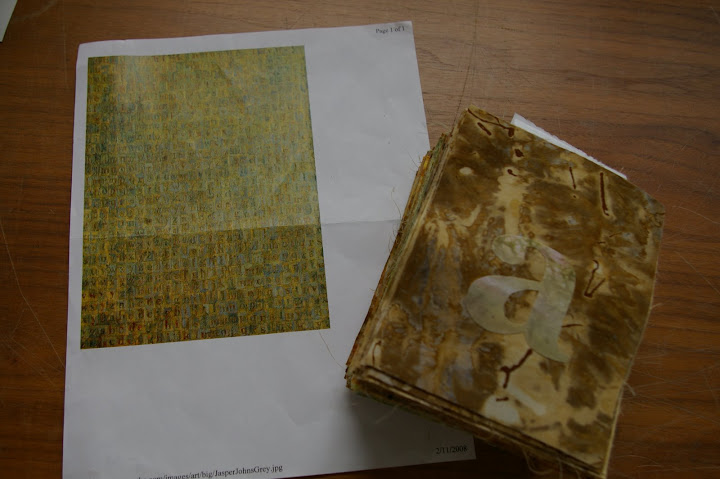
http://www.hencethe.com/images/art/big/JasperJohnsGrey.jpg
http://home.att.net/~jamestata/johns_green_target.jpg
http://artfiles.art.com/images/-/Jasper-Johns/Target-1974-Print-C10071319.jpeg
http://www.masterworksfineart.com/inventory/johns/1web.jpg
no reason, just curious. la, la, la….
a: It would definitely be between the first two… (in my opinion, of course…).. probably the second one I like the best. The green target is pretty rad too…
me: okay, one more question–what aspect of the first two do you like? colors? the boxes with things inside? the texture?
a: on the first one, the compliment of the turquiose and deep burnt red color are intitially what stand out and make me like it. along with that, the way that it is not a high contrast piece, – the color values and design is consistent throughout- but it still has a three dimensional feel to it. then of course, what i like about all of these types of jasper johns works, the graphic/mass produced nature of typeset letters/numbers, contrasted against the painterly nature of the pigments and brushtrokes.
me: did you go to art school or something? can you describe wine and music that descriptively too? :)
a: ha ha…actually, i SUCK at the usual artsy fartsy critique babble. i think i still have a book around here somewhere about how to talk that way… honestly though, its probably just a learned/acquired “dialect” just like the mumbo jumbo jargon/dialect of any arena.
me: THAT sounds more like you! plus, it makes me hungry and isn’t a bad description of his artwork either.
Did you see that there was a Jasper John’s print exhibit in Madison until the middle of April?”
(okay, back to the post and not e-mail quotes anymore)
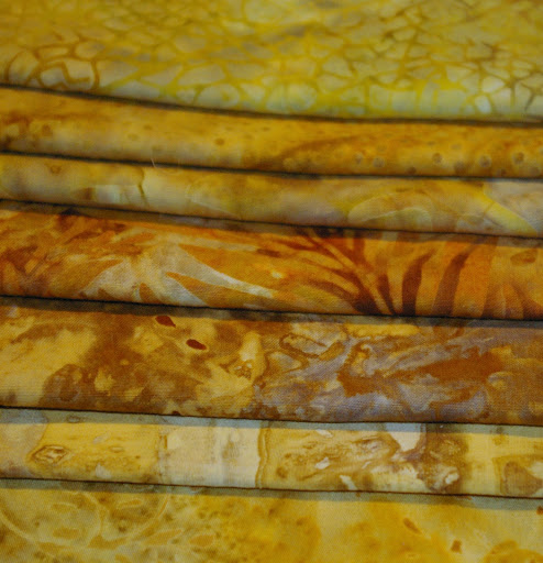
that last line was my sneaky way of explaining away why i would have brought up a conversation about her favorite artist out of thin air, but the real reason was that the exhibit had inspired me. i saw his works and thought to myself… hmm…. rows of square-like-shapes…. quilt-y! and i was on a mission to see if i could replicate one of his paintings for her in a quilt. so, with the feedback above, i took computer print-outs of the first two paintings (the numbers one and the letters one) to the fabric store and began searching through the batiks. if one of the main characteristics of these paintings was the “painterly nature of the pigments and brushstrokes” then i couldn’t just work with solids or regular prints. batiks fit the bill perfectly. i had less trouble finding fabrics that seemed to reflect the colors in the alphabet painting than the number painting, so i decided to go with that one and i purchased these prints (and a few more):
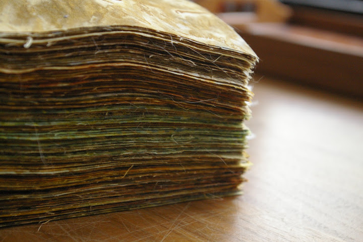
then i did lots of squishy math and decided to use 4″x5″ blocks and do 16 rows of 13 blocks each row (in the end, i actually changed it to 15 x 13 because it looked too long).
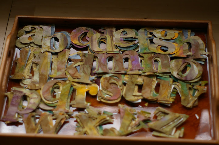
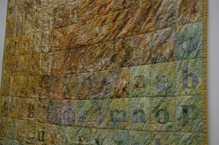
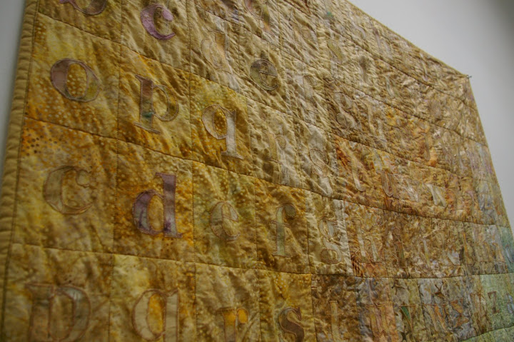
after cutting them out, the first task was to lay out the blocks in the least jarring pattern–making them look almost as though they are variations of the same fabric (i seem to have misplaced all of those “in-process” photos, but you’ll see the effects later, don’t worry). then came the hard part. the letters. there’s probably an easier way to do this, but please don’t tell me now as i’m not planning to repeat this quilt any time soon and knowing just how much time i could have saved will just fill me with useless regret. here’s the process i used:
1. find a font i liked for this project and figure out what size it needed to be to be in scale.
2. print out 8 copies of every letter, in mirror image.
3. roughly cut out each letter (there was too much white space and waste around each letter otherwise).
4. glue each letter onto the paper part of some iron-on stuff (can’t remember the brand name).
5. roughly cut out each letter again, this time with iron-on stuff on one side.
6. lightly iron the letters onto batik fabrics.
7. carefully cut out each letter (i especially began to hate the letter “g” during this process. i also bought a new pair of scissors and had to use sandpaper to alter the plastic handles which had a very sharp ridge where the mold came together and had rubbed a sore on my thumb. a surprising oversight in gingher scissors!)
8. strategically placed the letters onto the squares (and tried to discourage my cat from rolling around on this precarious arrangement).
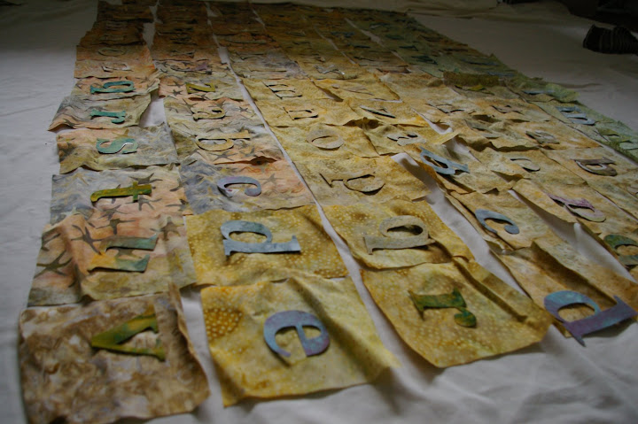
9. ironed the letters firmly onto the fabric squares, stacking them in careful order as i went along.
10. the fun part. applique! i zig-zag stitched around each letter. this part took awhile (a bit of an understatement). i listened to two different looooong audiobooks during this process.
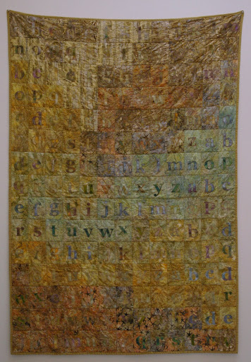
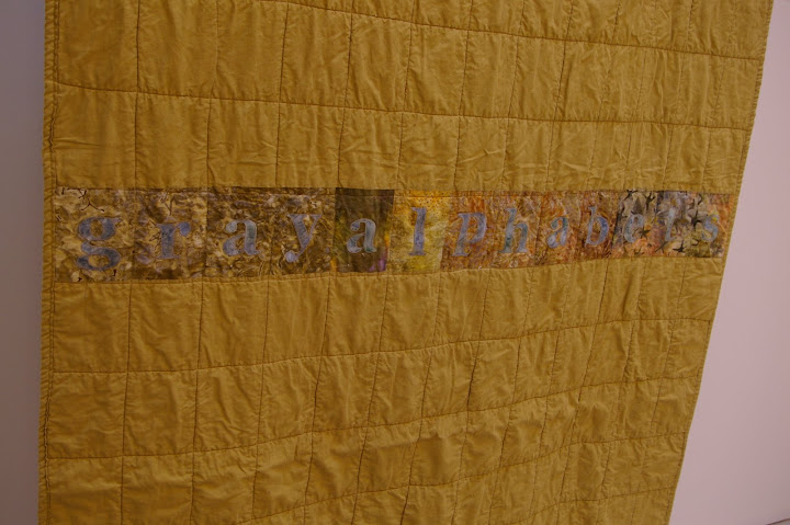
when the letters were finally all done, the rest came together rather quickly. i stitched the blocks into rows, and the rows into a quilt top. but i needed a back. what sort of back should i use? i waffled between several different options, and finally decided to use a solid color with a pieced strip in the middle. after trying a few things, i remembered that i still had one row of batik blocks cut out (remember reducing the quilt length from 16 to 15 rows?) that i hadn’t used yet. i also wanted to somewhere on the quilt give some sort of credit to the artist who inspired this whole crazy design, so i went to research the title of the painting. various sites listed the title as “gray alphabet” “grey alphabet” “gray alphabets” etc. and when i went back to the quilt, i realized that i had just enough blocks to spell out the title. oh dear. this also meant making more letters! sigh. i really wanted to make sure i had the title right, and after some research (including calling the menil collection in houston where the painting is currently housed) i determined that “gray alphabets” was the most correct variation. i cranked out the last 13 letters for this quilt and soon the back was ready to go. i pin-basted the whole thing together with the batting and stitched-in-the-ditch around each block (to emphasize the grid). i then made my own binding (first time i’ve tried that for a quilt!) and stitched it on by machine. i get so impatient near the end of a quilt. i just want to be done and i can’t be bothered to hand stitch anything as interminably long as the binding. luckily, i kept reminding myself, jasper johns’ paintings aren’t neat and tidy, so if there are some rough edges and imperfections, that just adds to the homage, right?
finally, it was finished. i washed it to get some good quilty wrinkles going on, then took it to a friend’s light-filled art studio to photograph it. wanna see?
i almost forgot to photograph the back until my artist friend asked to see it!
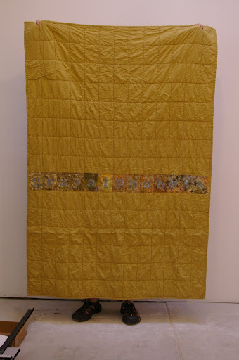
here’s mr. happy stuff’s long-suffering feet (and two fingers) holding the quilt up so we didn’t have to thumbtack it to the wall again.
and here is the quilt beside the inspiration painting:
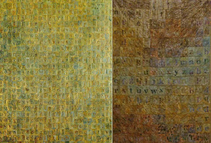
when i got done, i realized that my print out of the painting had been quite a lot darker than the on-screen version, but i figure that’s also probably rather different than the in-person colors, so i’ve decided not to care too much about that. i love the overall effect of the quilt. i love how most of the letters are very subtle against the background and i love the way the batiks blend into each other and i do love the shape of the letters themselves (i always love words, type, and letters in art) and i also love that my version can be cuddled up with on the couch and tossed into the washing machine whenever necessary.
i didn’t even take the time to wrap the quilt. i just bundled it into the only box in my house that fit and taped it up (i had some fancy packing tape that made it sort of look like gift wrap) and shipped it off to my friend with a note to call me immediately upon receipt. she graciously complied and even though i’d just given her a quilt in the middle of the dog days of summer, she did not complain about my poor timing (including the fact that it was late even for her half birthday), she just told me how much she loved it. and that’s really all the thanks i need. i’m so glad she likes it. (and if she had any suspicions about my “secret project” all this time, she didn’t let on. what a great friend.)
i think it’s maybe my next quilt will have lots of really large blocks. and no applique.


15 Responses to a gift for a friend.